2009-06-28

self initiated project 2: hello! bags (your belongings also do communication)


Project outcome 2:
Hello! Bags
(2009)

In this stage, I made cotton bags with face icon prints as my suggestion for the new way of communication.


The Hello! Bag helps to show your emotion to others by face icons.

Two different faces are printed on both front and back side, and the owner of the bag can change the face as she/he feels something during conversation with someone.
If the owner feels happy in the dialogue, happy face ;-) will stay but if not, unhappy face :-( will come on the surface.


We all humans have many ways to express our feeling luckily. Face expressions, body languages, voice tones and showing attitude etc.
Humans have been developing their possibilities by making tools and also emotion, I believe.
The reason I chose a bag for the outcome is, a bag is a tool for keeping our belongings as identity, and it takes us out from inside. I think a bag is a key to connect outside. In the outside world, we meet people and having conversation. This flow is necessary and we learn lots of things from relationship, and it brings mutual understanding among people. Humans are simple but complicated.
I made the bag to help to make relationship smoothly in the complex communication.

*Perhaps, your belongings also might do communication, no one knows!

Self initiated project 1: emotional literal communication


Project outcome 1:
Basic pattern design
(2009)

We often put emoticon/face icon to express and deliver our feeling on text message or e-mail.
By using these icons, plain digital conversation become much emotional and friendly.
My idea for the final major/self initiated project is using these icons to create an outcome of the new and modern way of communication.


This project is formed by three outcomes,

1: Basic pattern design (this page)
2: Hello! Bags
3: Patchwork of emotion


Degree Show website


You can now see some of my works on the degree show website of London College of Communication.
Please visit website below.

http://www.5to1show.com/#/student/typographic/aki-makita_1

Thank you.

2009-06-27

Sorry to invite this empty blog,, will update more and more soon!

Dear all,
Thank you for visiting this blog and sorry I haven't updated for long time.
I will put more work soon and please visit here again.

Now I have been making a proper website so when I finish making it, will inform about that here.
Thank you again!

Aki

2009-06-05

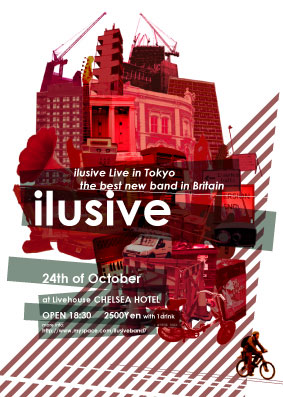
Ilusive gig flyer (2007)


Flyer design for London based independent band Ilusive
(2007)

It was the first time for the band to have a gig in Japan, so I intended to design "London-like design" but not really obviously.
Buildings or instruments, these images on the flyer are all make sounds as the band makes sounds and music too, and the red colour is placed as the symbol colour of London to make the strong impression that the band is from London.


ASAHI BEER summer campaign (2007)

ASAHI BEER summer campaign (2007)

Designing a symbol of the sun for the summer campaign of 2007.
I designed the sun which is represented both sunrise and sunset.
This advertisement was appeared on adverts on the tube station, numerous newspapers and magazines. (Londonpaper, i-D, Dazed&confused etc.)

2009-06-03

Book design for Dr.Jekyll and Mr.Hyde


Final Piece - Cover


---------------------------------------------------------------------------------------------

Sketchbook works - research and making idea


Project detail
Using whole texts from the novel Dr.Jekyll and Mr.Hyde and creating new reperetation for it.

Resolution
Book design with mirror papers

(2008 Spring)

- - - - - - - - - - - - - - - - - - - - - - - - - - - - - -

Concept

I picked up a mirror as a transformation object as Jekyll used medicine to be Hyde.
Also, through reading the book, I often find that Jekyll looked at mirror to check his figure.
Mirror (or picture) is only one object that we can see ourselves with objective view, and Jekyll might looked at inside of himself objectively by the medicine.
Actually we can not judge Hyde is bad and Jekyll is good, because both of them were radically figured by a person: Jykell. I found the phrase of Greek philosphy that is “If you would like to know the fact, see yourself in the mirror. And everything would be evident.”Words sould be always subjective, so my idea is if we look at Hyde and Jekyll’s words carefully through a mirror, we might find the fact or something beyond the words.


I made a book and it is composed of two parts, the Left side is mirror part and the right side is words part.
In word parts, I put words of characters next to the mirror to be visible when reader see the words in the mirror. Only Jekyll and Hyde’s words are reflected so we can read the whole text only when we look it in the mirror.
When people do slant the mirror parts, also they can play with line of words as they see own face objectively.


About book cover design, I drew an image by my first impression of the story.
There was something foggy and gloomy image in my mind.
The drawing is like smoke or fog, and it also could be image of the moment of transration (Jekyll became Hybe), Jekyll’s Feeling and Hyde’s mind. I tried to make the book like a picture book for adult because children do transformation-play, and Jekyll (as an adult) brought it into reality.
Transformation is permanent dream for every people and my aim of this work is to make feeling of nostalgia for childhood for adult.