2009-11-14

KOBE ROCK STREET flyer design

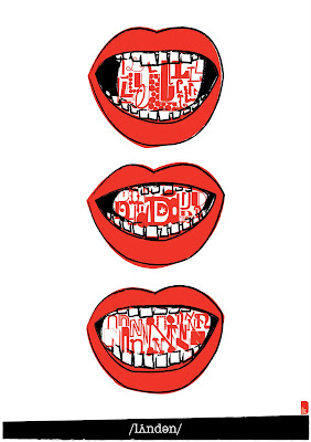
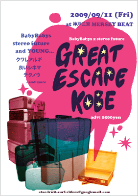
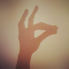
Flyer design for the indie music event "KOBE ROCK STREET" in Kobe, Japan (2009)

This flyers are designed for a indie music event.
I was asked to make flyers like an image of the morning in winter, and I used calm and warm images that I can see the view from my window, and chose quiet like typo and colour for the design.

Hello, I am in Japan!

Dear all,

Hello there!
I currently went to back to Japan, my mother country.
It was great experience to study in the most exciting artistic city London, and I hope I can use these experiences and ability in future here in Japan or anywhere.
If you have something, request or giving me job opportunity, please contact me.
We have great technology, internet, that enable us to submit work from anywhere!
Keep in touch and thank you for reading this!

Aki Makita


new mobile number: +81 (0)80-4205-7632

2009-09-16

Join in the London Design Festival

Dear all,

I am joining emerge, the debut graphic design graduate showcase of the london design festival.
I will exhibit face bags work which is one of the final major projects in university.

Venue:
Rich Mix
35-47 Bethnal Green Road,
London E1 6LA

19-27 September 2009
Open Daily 10am-6pm
Admission free


*

Also my poster will be exhibited at London Poster exhibition in V&A museum.

Venue:
Victoria and Albert Museum
Sackler Centre
Cromwell Road
London
SW7 2RL

19 Sep-27Sep
Opening times:
10:00-17:45 daily
10:00-22:00 Friday

Free admission

*
If you have time, please come and see my work:-)
thanks!

2009-09-12

My name is,


Typography/2009


When I look at myself, I feel I am made of countless materials. DNA, gene, other chemical elements, memories, emotion, favourite things,


talent, experiences, character, identity and etc,.

These each thing is vital to talk about who I am and what myself is, and they all elements have diffenrnt colour and shape that I made and painted in my life.


My name is Aki Makita, and I can write it as 牧田亜希 in chinese character. I made the typography for myself.

Alfavet is basicaly simple and symbol. Firstly, I made minimal typoface for my name, and painted out the empty spaces by multi colours. It became like mosaic art. I love it.


Through the process to make it, I felt it is just like our lives themselves. When we are born, we have nothing, we just have a name and sex and we were white. But as we walk in our own lives, we will see and experience many things and gain sense of values.

Then I would like to ask you, what is your colour?


flowers


I just think flowers must be gift from nature.
We can enjoy them with five senses. Smelling, feeling, enjoying their colour, shape and texture, even eating is possible!

2009-09-07

PHOTO NEXT 2010 logo design conpetition


These logo design were designed for the photographic industrial exhibition "PHOTO NEXT 2010".
The exhibition is going to hold for the first time to promote and introduce film-based photograph equipments for develop and printing.

I chose CMY colours for the image to represent basis of the creation, and the layers of colour represent development as the layers make new another colours.
I placed the typo in random way, it also represents possibility and change as the future of photography have them and also the exhibition is on the starting line.

2009-09-06

emotion of breeze


emotion of patchwork

Sometimes I feel weather would have emotion too as we human have.
The heavy rain seems like the sky is deeply sad and crying. Under the strong sunshine, I imagine the sky is super happy, etc.
I did shooting of my work in a park today, and there was continually small wind during the term. The cloth was swinging and dancing in the breeze. It seemed the wind shows its emotion by the waver.

2009-09-02

S and Moon


I drew Moon, my flatmate while she was making typoface.
Kind of exchange the fields.
(She did illustlation and I was in typo course in the uni.)

then has she made the typoface for S?
let's have a check her blog :)


2009-08-31

Sounds of London


London Design Festival 2009 Poster competition
(2009)


‘Working with graphic designers and typographers we aim to celebrate another aspect of design that is renowned in London. The poster is one of the oldest and still most powerful mediums that is used to communicate. It has been used to convey political, social and environmental messages. Posters help sell products, bands & ideas, events, in fact, every conceivable part of our society is still exposed to the poster

– Quote Domenic Lippa

The brief is to produce a poster celebrating London.

*

My idea for a poster comes from the image of London as one of the biggest international capital.
People comes from different countries and places, and use English for communication and it also make their identities by accent or pronunciation.
How do you hear 'LONDON' when Chinese people say the word? or Spanish? Italian?
The sounds is different, and people feel London in different ways in this big capital.

2009-08-30

drawing and chatting at night with cup of tea


01: 灯り lights
02: うろ覚え vague memory
03: 髪飾り decorations

Last night, my friend visited me and we doodled with cups of tea.
I remember my childhood and always did drawing.

2009-07-30

Stereo future x Babybabys event flyer design
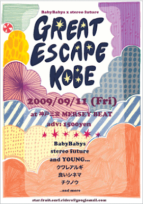


Flyer design for the indie music event in Kobe, Japan (2009)

This event is going to be organised by Kobe (Japan) based indie bands.
I designed these images with inspiration from these line-up band's musics (pop and jazzy), and also the title: Great Escape Kobe gave me the idea of 'off to travel somewhere like the unknown world with curiosity' as music always brings us out new front.

2009-07-19

Degree Show


5:1 LCC BA G.M.D course Degree show
25/06/2009-03/07/2009
at London College of Communication


I exhibited...
Forest anywhere -The Little Red Riding Hood in Isotypes (Transformer project)
'eks (Past Present Future project)
Patchwork of emotion (Self initiated project)


If you have visited the exhibition, I would like to say thank you for coming.

2009-07-03

my boxes.


My boxes.
Illustration for a Japanese free paper
issue in July 2009.
(2009)

The concept of the free paper is "looking at inside brain".
I drew these illustration from my obsession.
I feel something like sympathy for simple and inorganic things like dots, lines and box.
They are beautiful and living in the inside of my brain, and always give me inspiration.


2009-07-02

Forest anywhere


Final major project 3:
The Little Red Riding Hood
outcome 2/Shooting in the kind of dangerous areas as the forest
(2009)

The tale the Little Red Riding Hood has another aspects that is the warning of the wolf (=man) for girls.
I placed the isotype illustration on the wooden boards in the sort of dangerous areas in London, for instance SOHO, Camden Town, Kilburn, a park and on a night bus.
Through research of sexual offenses, most of occasions are committed by offenders who victims know (e.g. ex-boy friend or colleagues), and no where is safe except you beware even boys also become victims sometimes.
Anyone could be the wolf, anywhere could be the forest and anyone could be the Little Red Riding Hood.


The Little Red Riding Hood in isotype


Final major project 3: (Transformers)
The Little Red Riding Hood
outcome 1/isotype
(2009)

This project is about transforming something (film,book,music etc.) into another format.
I chose the fairy tale The The Little Red Riding
Hood and transformed to isotype that is symbol
communication without words.
Because of fame of the tale, we do not need to
describe the story anymore and my idea is letting
audiences narrate by themselves through the
illustration/isotype.